PHOTOSHOP COLOR MANAGEMENT
COMPLETE GUIDE TO COLOR SETTINGS
Color management in Photoshop is essential to ensure that the colors you see on your monitor match the real world both for web delivery and for print. In this quick guide, you’ll learn how to configure Color Settings properly and build a consistent workflow.
1. What Color Settings are
Color Settings define your working color spaces (sRGB, Adobe RGB, ProPhoto RGB, etc.) and control how Photoshop interprets colors in files you open or import. Setting these parameters correctly ensures color consistency between your monitor, print output, and digital devices.
2. How to configure Photoshop step-by-step
Follow these steps to set up color management correctly:
- Open Edit > Color Settings… in Photoshop.
- From the Settings menu, choose “Europe Prepress 3”.

- In Conversion Options, set the Intent to “Perceptual”.
- Click OK to save and close the window.
- Restart Photoshop to apply the changes.
3. Handling embedded profiles
When you open a file that contains an embedded color profile, Photoshop can:
- Preserve the embedded profile: recommended to respect the file’s original color appearance;
- Convert to the working space: useful to standardize all images under one single profile;
- Disable/ignore profile management: only for specific edge cases (not recommended in a professional workflow).
4. Why use ProPhoto RGB for RAW post-production
ProPhoto RGB is a very wide-gamut color space ideal for preserving as much color information as possible from RAW files. Using it during editing helps you adjust exposure, white balance, and color without losing gamut or saturation, delivering maximum quality for printing or professional workflows.
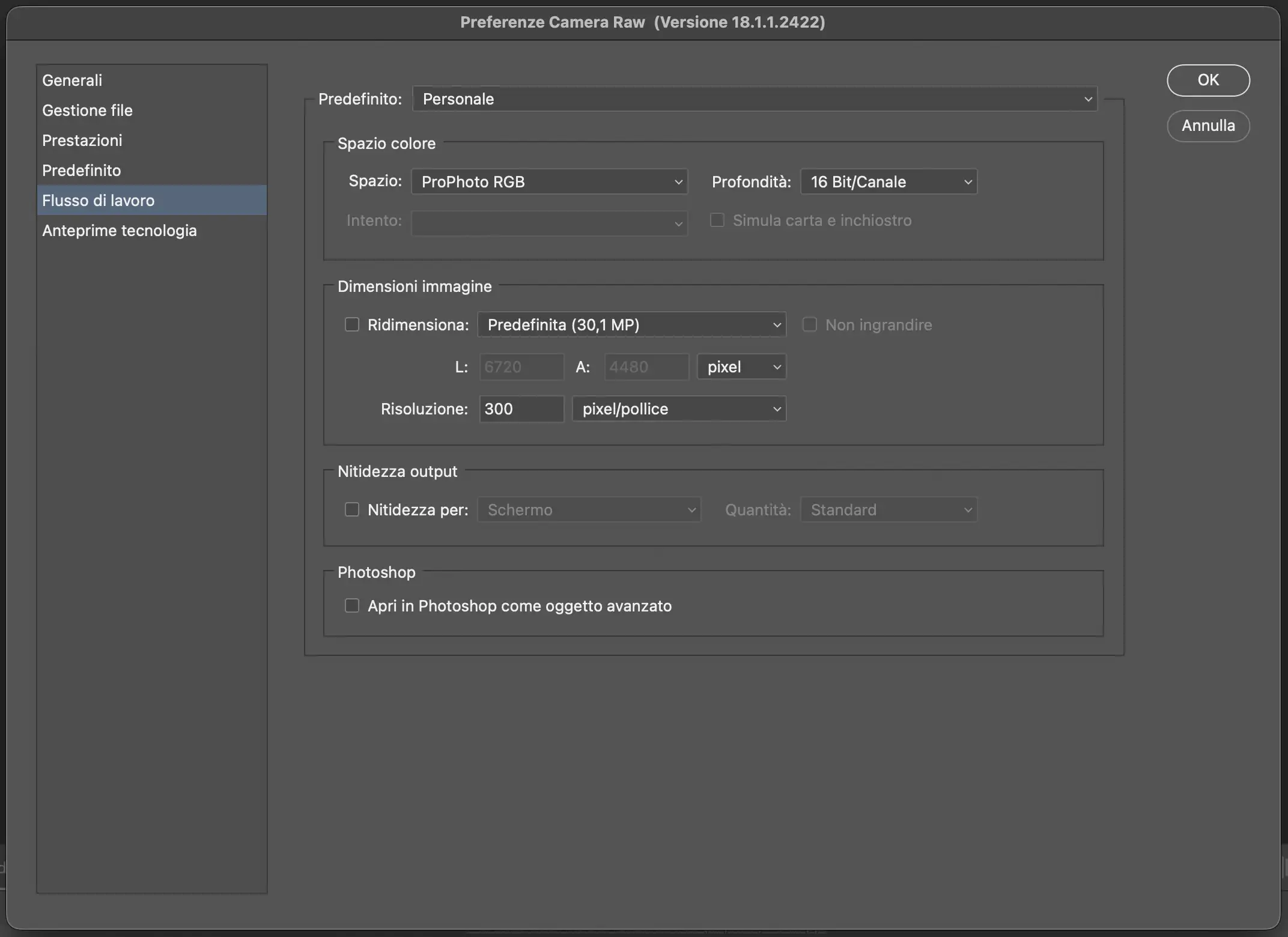
5. How to set ProPhoto RGB in Camera Raw
- Open a RAW file in Photoshop or Adobe Bridge; it will open in Camera Raw automatically.
- Go to Settings (the gear icon in Camera Raw).
- Open the Workflow Options and set the color space to ProPhoto RGB with 16-bit depth for maximum quality.
- Save the settings: all subsequent edits in Camera Raw will be processed in ProPhoto RGB, preserving the RAW’s color integrity.
6. Tips for a professional workflow
- Always work on monitors that are calibrated and profiled for photographic use;
- Use wide-gamut spaces like Adobe RGB or ProPhoto RGB for RAW editing and printing;
- Keep profile mismatch warnings enabled to prevent color inconsistencies;
- Convert images only when needed. For web export, always convert to sRGB and embed the profile in the file.
Photoshop color management isn’t just a technical detail, it’s the key to professional results for both print and web. Calibrating your monitor, choosing the right working spaces, and understanding how Photoshop handles profiles lets you work with confidence and achieve accurate, faithful color.
Take the time to set up your workflow properly and, if you want to go deeper, explore my post-production courses to get the most out of your display and your images.
Before setting up Photoshop, make sure your monitor is calibrated for accurate and reliable color.
Read the complete guide to calibrating the MacBook Pro Mini-LED XDR display →
MacBook Pro Mini-LED XDR Calibration Guide