Leggi la guida completa in italiano:
Guida sRGB vs Adobe RGB vs ProPhoto RGB (Italiano)
COMPLETE GUIDE: sRGB VS ADOBE RGB VS PROPHOTO RGB

WHICH ONE TO CHOOSE FOR WEB, PRINT, AND EDITING (WITHOUT WORKFLOW MISTAKES)
Have you ever noticed different colors between Photoshop, Lightroom and your browser? Or a print that doesn’t match what you saw on your monitor?
It often goes like this: the photo looks perfect in Photoshop, then you export it and in some apps/platforms it looks duller, or in print “something” feels off.
In good faith, you blame the camera, presets, or the lab… but most of the time the cause is simpler (and more technical): color management.
The color space (sRGB, Adobe RGB, ProPhoto RGB) and the ICC profile determine how RGB values are interpreted and converted across your workflow.
Understanding this is what gives you consistent, predictable colors and reliable exports for web and print.
In this guide you’ll find a clear explanation of the differences between sRGB, Adobe RGB (1998) and ProPhoto RGB, with practical rules to choose the right space based on your destination: web, print or a master file.
Quick troubleshooting (before you start)
- JPEG looks “dull” or different on the web: it was likely exported in Adobe RGB or ProPhoto. For web/social, export sRGB + embedded profile.
- File received without an ICC profile: RGB numbers are ambiguous. Before correcting colors, verify whether you should assign the correct space (only if you’re certain about the source).
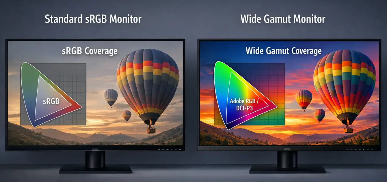
- You can’t see any difference between sRGB and Adobe RGB: that’s normal if your monitor only covers sRGB (or isn’t calibrated/profiled). To evaluate wider gamuts you need a wide-gamut display and color-managed applications.
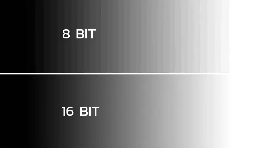
- Banding in gradients: common with 8-bit files after heavy edits, especially in very wide spaces. Keep a 16-bit master.
- Print doesn’t match the monitor: without the lab/printer ICC profile and soft proofing, results are often unpredictable.
- Monitor too bright: if you print, excessive luminance often makes you brighten files too much. Calibrate consistently with your viewing environment.
Golden rule: master file (editing) ≠ output (destination). You choose output based on web or print.
1. Basics: color space vs ICC profile
A digital file contains numbers (RGB). The color space defines which colors those numbers can represent (gamut) and how they’re distributed. An ICC profile is the information that allows compatible software to interpret those numbers correctly.
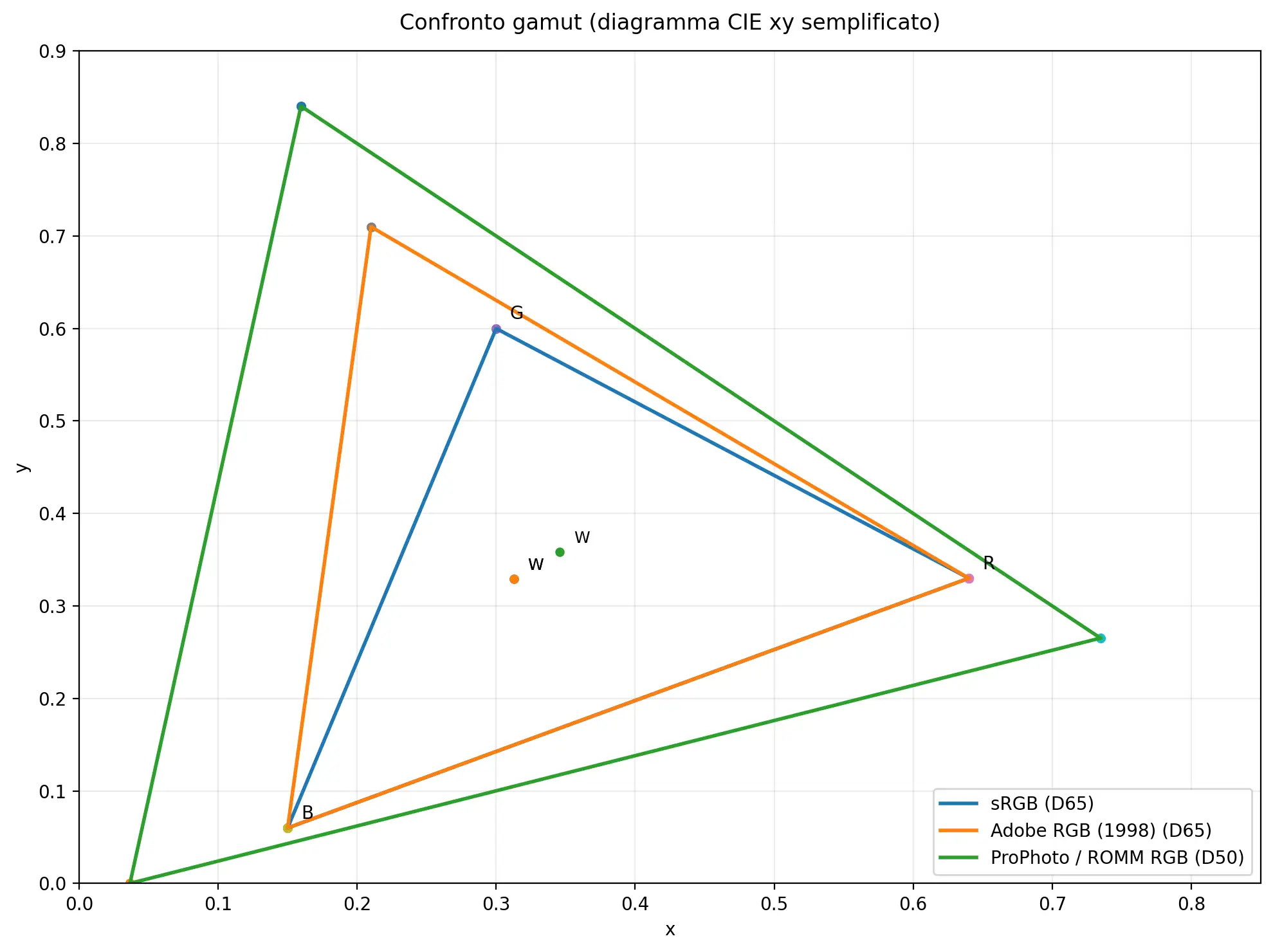
2. sRGB vs Adobe RGB vs ProPhoto (what really changes)
In practice, the main differences are: gamut (how wide the colors are), white point, tone curve, and precision (bit depth) during editing.
- sRGB: maximum compatibility (web/apps/devices). Smaller gamut, so some saturations can be clipped.
- Adobe RGB (1998): wider than sRGB (especially in cyan/green). Useful for managed print workflows or when requested.
- ProPhoto RGB: very wide gamut. Great for master files and advanced editing, but requires discipline (correct profile and preferably 16-bit).
3. Bit depth: why 16-bit is essential (especially with wide gamuts)
The wider the color space, the higher the chance that an 8-bit file will show artifacts (banding/posterization) after heavy adjustments. That’s why, when working in wide spaces (especially ProPhoto), it’s best to keep a 16-bit master (PSD/TIFF) and convert to 8-bit only when needed for export.
Quick check (clean master file):
- Master file in 16-bit PSD/TIFF
- Wide working space (if you do advanced editing)
- Conversion and compression only at export
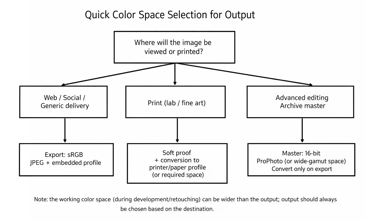
4. When to use sRGB (web and “universal” delivery)
Use sRGB when your destination is:
- web and social media
- delivery to clients/agencies without color specs
- general-purpose JPEGs for decks, email, chat
5. When to use Adobe RGB (1998)
Adobe RGB (1998) is useful when you’re working in a controlled pipeline and you have a practical reason to use it:
- printing/labs where it’s requested or stated as a standard
- projects where you want to preserve more gamut than sRGB (especially in cyan/green)
6. When to use ProPhoto RGB (master files and advanced editing)
ProPhoto RGB makes the most sense as a master-file working space when you do heavy retouching and color grading, or when you want to preserve maximum quality before soft proofing and final conversions. It’s not a “web delivery” space.
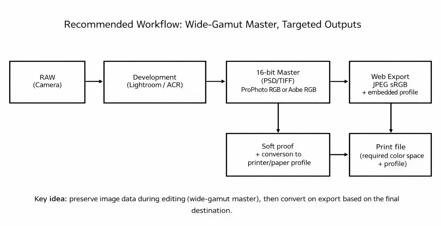
7. Recommended workflow (Lightroom / Camera Raw / Capture One / Photoshop)
A stable workflow always separates the master file from the output:
- RAW development: edit without “choking” the image into an output space that’s too small.
- Master file: save a 16-bit PSD/TIFF (wide space if you do advanced editing).
- Output: convert based on destination (sRGB for web; lab/printer/paper profile for print).
8. Common mistakes (and a quick checklist)
- Web: exporting in Adobe RGB/ProPhoto instead of sRGB.
- Editing: working in 8-bit and pushing adjustments too hard on gradients/skies.
- No profile: correcting “by eye” without understanding how numbers are interpreted.
- Print: skipping soft proofing and the destination profile.
Checklist: embedded profile ✔︎ · 16-bit master ✔︎ · convert only at export ✔︎ · sRGB for web ✔︎ · soft proofing for print ✔︎
FAQ
No. ProPhoto is excellent for master files / advanced editing (preferably 16-bit), but it’s not the right choice as a universal output for web/social.
In most cases no: if your destination is web/social, the correct output is still sRGB to minimize viewing issues. Adobe RGB makes sense in controlled RGB workflows or on specific request.
Mostly for JPEGs and previews. The decisive choice is the color space at export and your end-to-end color management (profiled monitor, embedded profiles, correct conversions).
Conclusion: there’s no “best” color space only the right one
At this point, the goal isn’t to “pick the best color space” in absolute terms—it’s to choose what’s right for the destination.
A wider space doesn’t automatically make an image better, just like a smaller space isn’t “wrong”: it simply changes the trade-off between compatibility and preserving information.
- Web / Social: almost always sRGB + embedded profile.
- Print: soft proofing + the destination profile (printer/paper or lab specs).
- Master / Advanced editing: 16-bit PSD/TIFF (wide space if needed), convert only at the end.
If you set your workflow this way, colors stop “changing” between software, monitor, web and print: everything becomes more predictable and repeatable with far fewer headaches! 🙂 .
If you want to go deeper and build a reliable workflow from start to finish, continue with the related guides: Photoshop color settings, ICC profiles, the difference between Assign Profile and Convert to Profile, soft proofing, and correct web export.
Together, these are the building blocks that eliminate color inconsistencies for good.
Read the English versions:How to Calibrate the MacBook Pro Mini-LED XDR Display (2026)Photoshop Color Management: Complete Guide (ICC Profiles & Color Settings)
Do you have a question about your specific case?
Write to me here